
Facts about Fakes: An Eye for Style
The combination of design and execution by the artist and engraver is what makes many coins more desirable.
The appearance of a coin tells a story that is made up of many chapters, one of which is named “style.” Style is something that I cannot easily put into words, but it is associated with a particular group or type of object – in our case, coins. Good style is best recognized by an experienced eye. This experience is something we all can acquire with dedication and “time in.” Putting it simply, you’ll know it when you see it.
A pleasing style is achieved through a combination of design and execution by the artist and the engraver. That combo makes many coins more desirable, popular, and pleasing to look at in our collections.
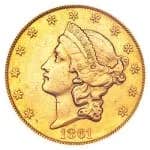
I first learned about a coin’s style from ancient coin dealers, where the style of these coins is a major determination of their eye appeal. Due to the way they are made, ancient coins of the same type have more variation than most coins from the 18th century onward. Style is less of a factor with today's coins, which are produced in very large numbers and look basically all the same. Aside from rarity, their desirability comes mostly from the condition of their surface and outside factors such as color. Nevertheless, some coins are more attractive than others. For example, which of the designs below do you find more attractive, the dollar or the quarter?
As an authenticator, I also learned to use the word “style” with regard to the appearance of a counterfeit coin. Although attributes such as weight and fineness may expose a fake immediately, they do not define a coin’s style – its overall look and the execution of its design in relation to that of the genuine coin for which it passes. The more precisely a counterfeit coin duplicates a genuine piece, the more deceptive it will be. Now let me throw you a curve ball. Look at the numeral “3” on the different Capped Bust half dollars in the two images below. Which image has the best “style?” Which numeral “3” is on the counterfeit coin?
Neither. Each of these coins is genuine. Can you guess which one is called the “patched 3?” This kind of anomaly is the reason I tell students that, sooner or later, any tell-tale characteristic seen on a counterfeit coin (including poor style) can be found on a genuine coin.
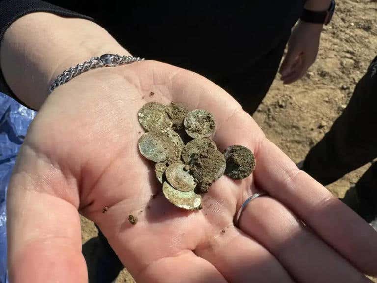
I have not spent much space in this column on pre-18th-century coins or ancients because that is not my area of specialization. Yet it is very important to recognize that over certain periods of time, the prevailing “style” of a country’s coins changes so that many coins designed centuries ago, like the one below, would be considered crude or poorly styled coins today. Nevertheless, many centuries-old coins make our coins of today look blah!
I’ll assume (you know what that does, wink) that by now, most readers realize that in order to authenticate a coin, you must know what a genuine example should look like. By looking at enough genuine examples that you collect, you will be able to realize that something is not “right” about a particular coin when you see it. In many cases, it is because of the coin’s poor style. The coins below are a comparison of parts of the design of a silver Eagle bullion coin. The difference should be very easy to detect, yet this poor fake fooled at least one collector.
You may also like: